How to create Designs that use Responsive Typography in Figma

A step by step guide on creating designs with multiple layouts that change layout and the styling that is applied to text as the width of a frame changes.

Oscar de la Hera Gomez
Written by Oscar de la Hera Gomez
First published on 08/16/2023 at 12:14
Last Updated on 08/17/2023 at 10:26
<p>A flower that represents Figma with the text "Responsive Typography" beneath it.</p>

A step by step guide on creating designs with multiple layouts that change layout and the styling that is applied to text as the width of a frame changes.

SubscribeCheck out our Responsive Design Figma Guide

Please note that design systems such as the one laid out in this article are only available on education, professional or organization Figma accounts.

Check out our Figma Variables GuideWhat is a Design System?

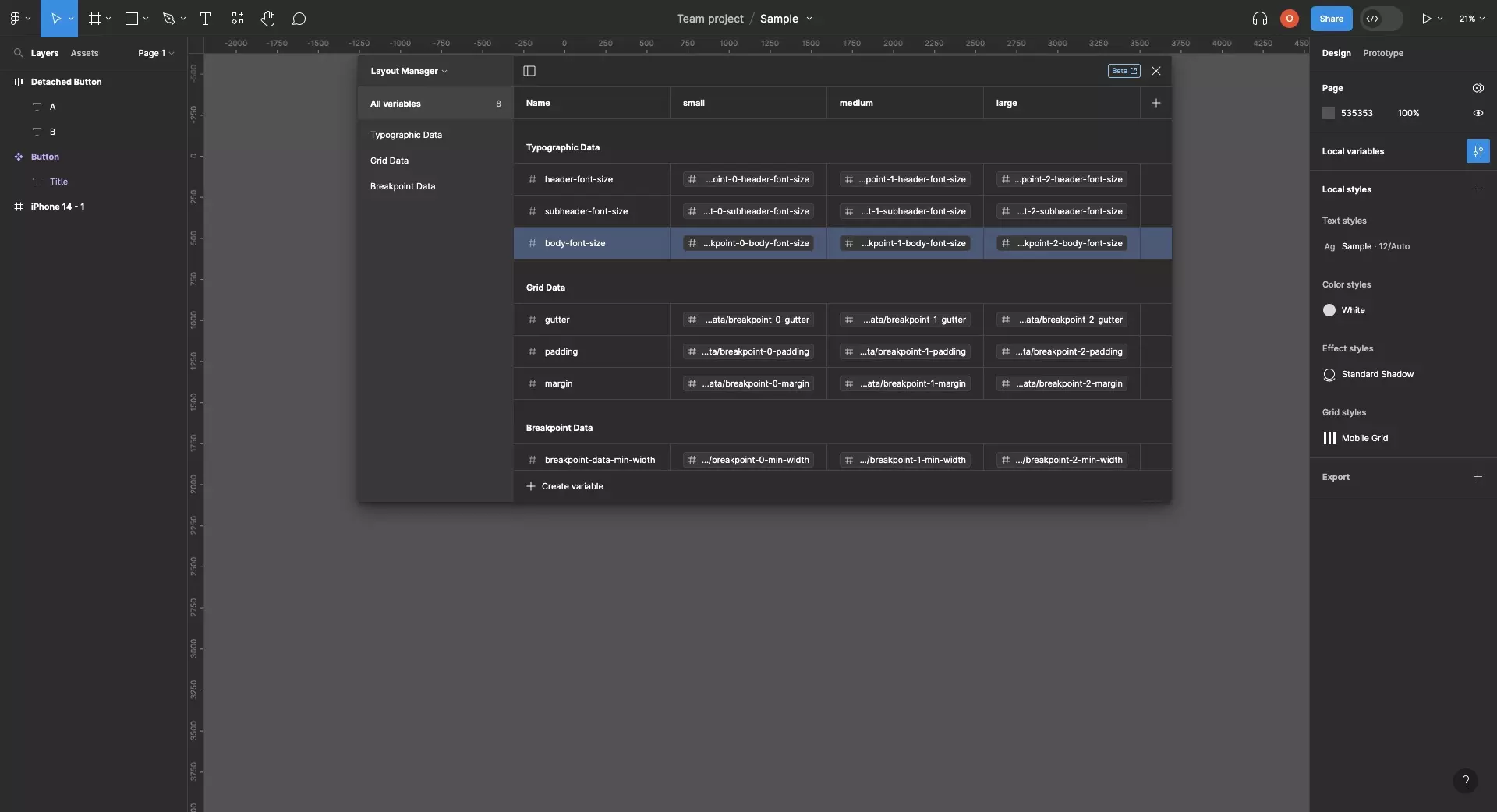
Step One: Create the Typographic Styles

<p>A screenshot that shows how the styles for delasign.com change as the breakpoint changes.</p>

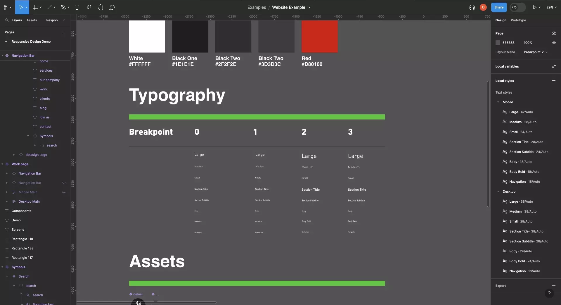
Create typographic styles to match the look and feel for each breakpoint of your design system.

How to create and use text styles in Figma

Step Two: Create the Screen driven by Responsive Layouts

<p>A screenshot of Figma highlighting that a frame that has two identical layouts with varying typographic styling. The layouts are applying text variables to ensure consistency across the text.</p>

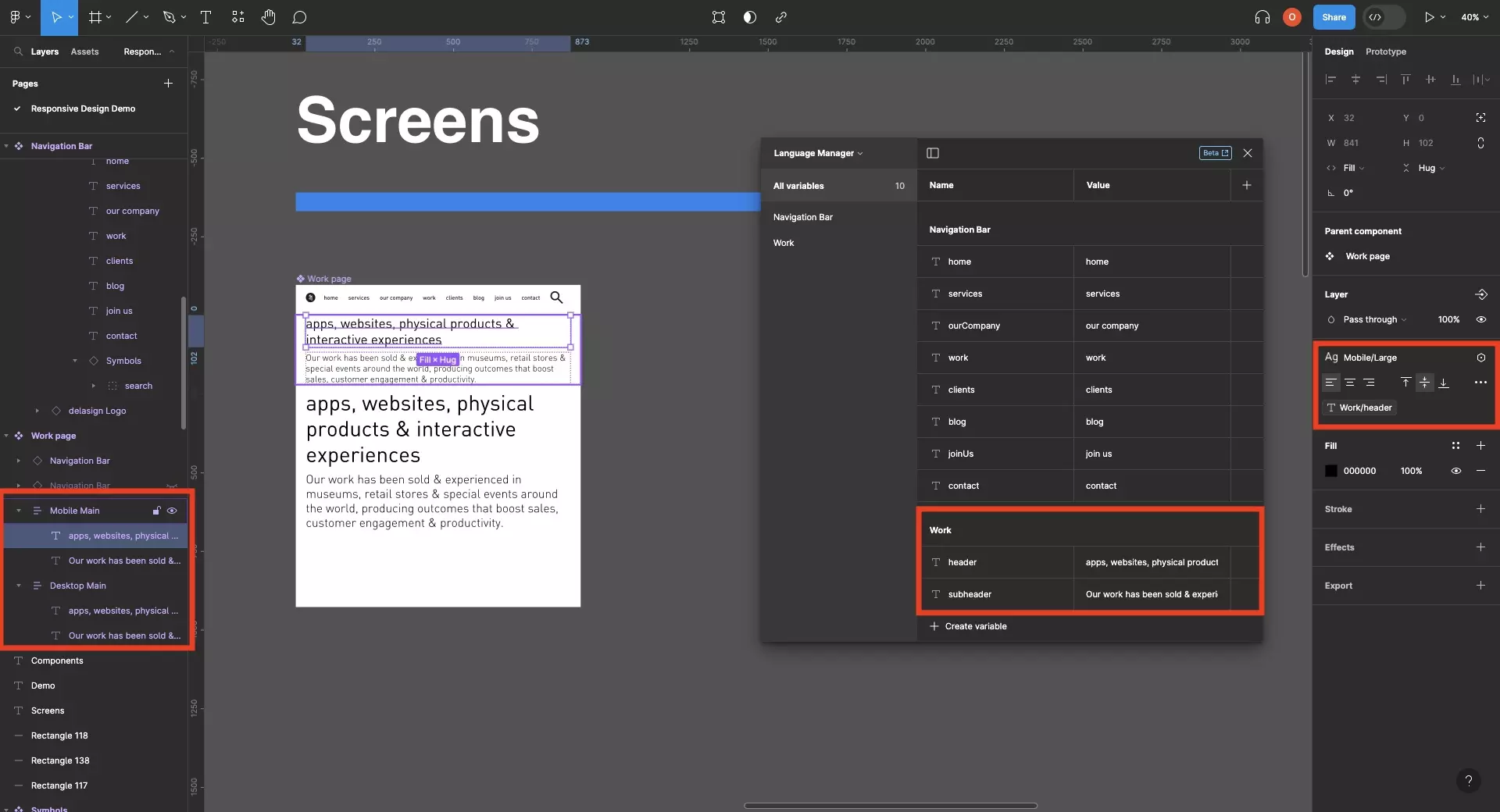
Follow the tutorial below to learn how to create responsive screens that use multiple layouts.

Apply the relevant typographic style to each layout (i.e. mobile styles -> mobile layouts, desktop styles -> Desktop layouts).

How to create Screens that use Responsive Layouts in Figma

Step Three: Test

<p>A screenshot of Figma that shows 4 sections for each of the 4 breakpoints of our design system. Each section is configured to the variables of a different breakpoint and Figma shows how the layout changes and the type adapts across the breakpoints.</p>

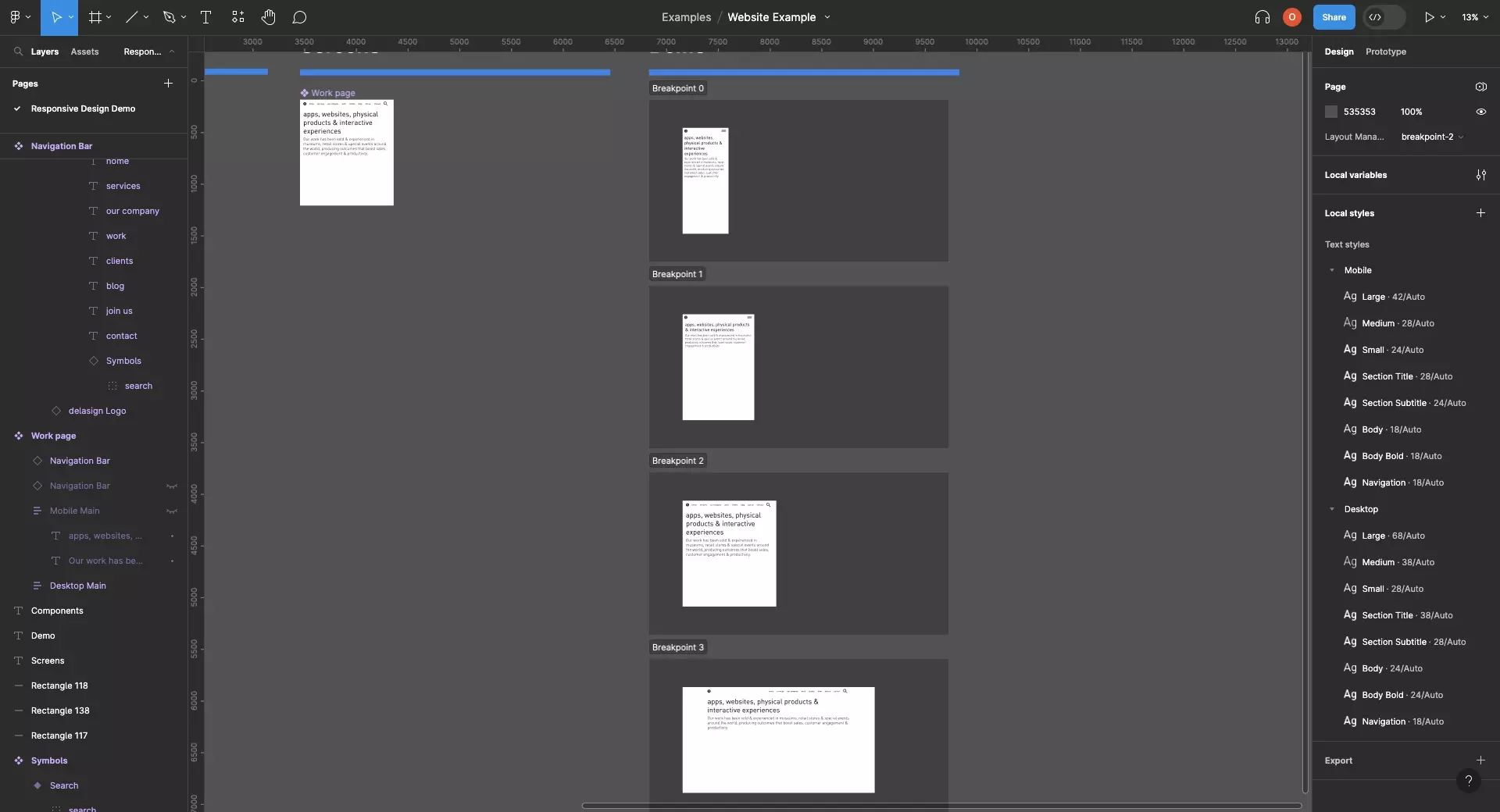
Create sections for each breakpoint of your design and add the component to each section.

Set the breakpoint of each section to the relevant breakpoint you'd like to preview.

How to create a Section in FigmaHow to set the Variable Modes of a a Section in Figma

Frequently Asked Questions (FAQ)

Can I use variables to create responsive styles ?

<p>A screenshot of Figma showing the Layout Manager that we created for our sample Design System.</p>

Although you can create variables with the intention of creating responsive styles, you unfortunately cannot yet use variables to create responsive styles.

How to create a Design System using Variables in Figma

Looking to learn more about Figma and Responsive Design ?

We recommend you check out our Responsive Design Figma Guide or search our blog to find educational content on learning how to use Figma.

Check out our Responsive Design Figma GuideSearch our Blog

Any Questions?

We are actively looking for feedback on how to improve this resource. Please send us a note to inquiries@delasign.com with any thoughts or feedback you may have.
SubscribeContact UsVisit our BlogView our ServicesView our Work

Partner with us

We would love to get to know you and see how we can help your organization with its goals and needs.
Let's Talk

Stay Informed

Get occasional updates about our company, research, and product launches.
Subscribe