How to create a Styleguide in SwiftUI

A step by step tutorial describing our method for creating a source of truth for custom styled text in SwiftUI. Github repository included.
The following tutorial is based on our styleguide tutorial for Swift and has been adapted to work with SwiftUI and Swift previews.
The example can be found on the main branch of our SwiftUI Open Source Starter Project linked below.
Please note that at this time it is not possible to overwrite the standard Font styles (i.e. .title, .body) in SwiftUI.
The key differences from our Swift example are the following:
Fonts
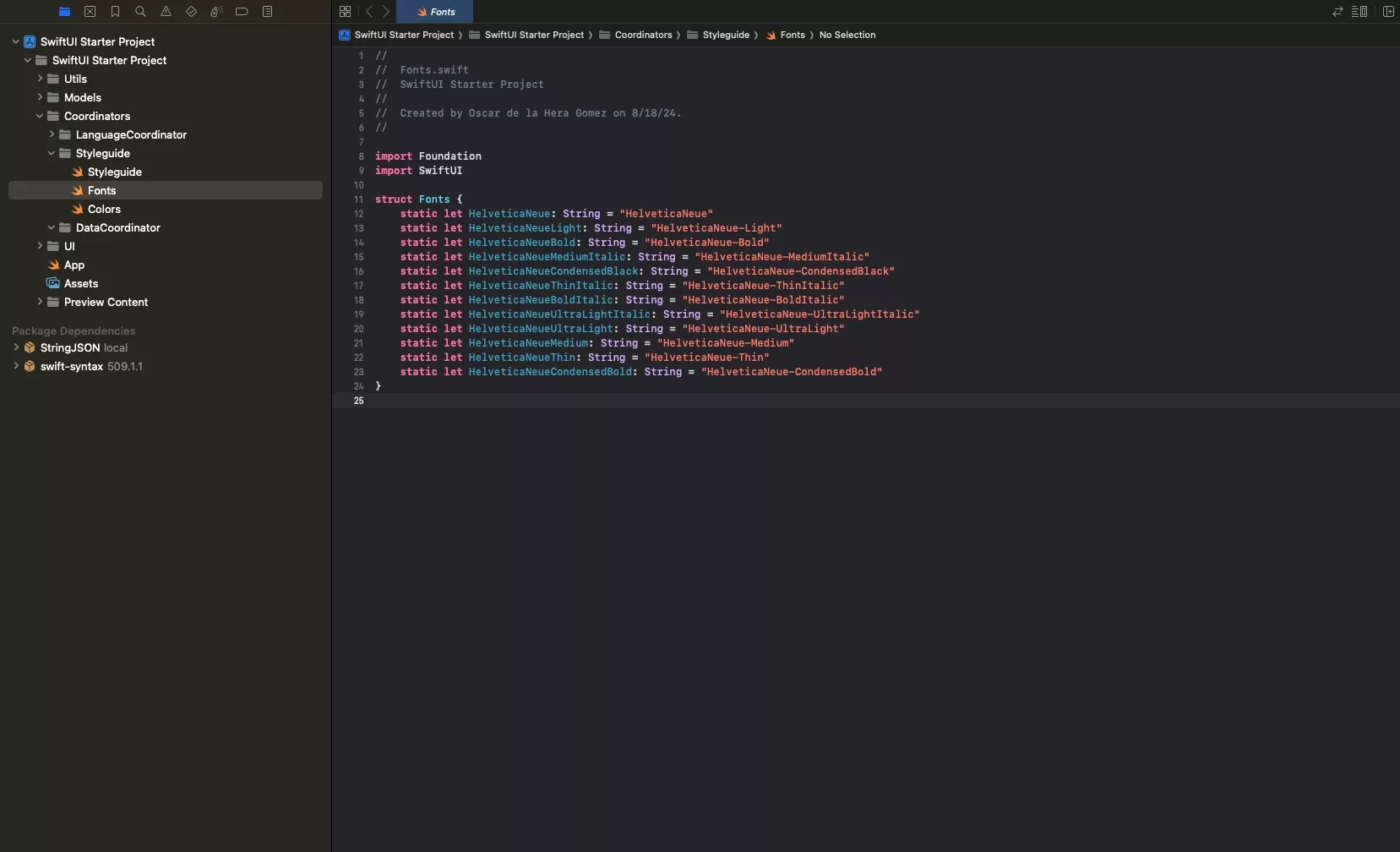
The following updates have been made to the Fonts.
- We have placed the Fonts under the Styleguide folder (previously under Models/Constants).
- We have made all the font definitions static to facilitate the use of these constants.
Colors
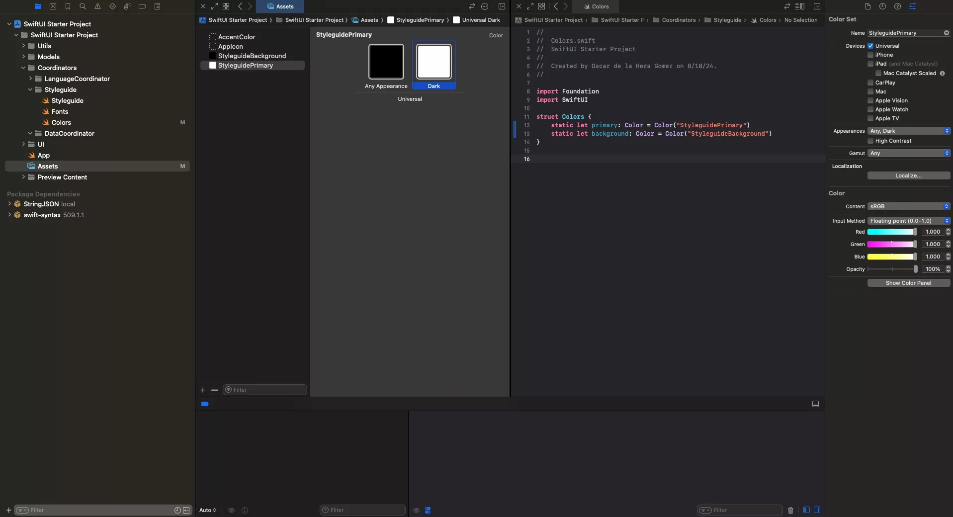
The following updates have been made to the Fonts and colors.
- Colors have been declared as Color Sets within the Assets of the app. This is beneficial as they will automatically adjust to the relevant color scheme, removing a lot of code from our Styleguide.
- Similarly to the fonts, we have defined the Colors using static constants within a Color structure found within the Styleguide folder (previously under Models/Constants).
- Colors now use Color type instead of UIColor and map to a text definition that matches a color set within the Assets of the app.
Please note that you must NOT name color sets "Red", "Green", "Primary" or "Background" as these conflict with the Apple System definitions. Apple has yet to provide a means for developers to alter the standard color scheme.
Color Scheme
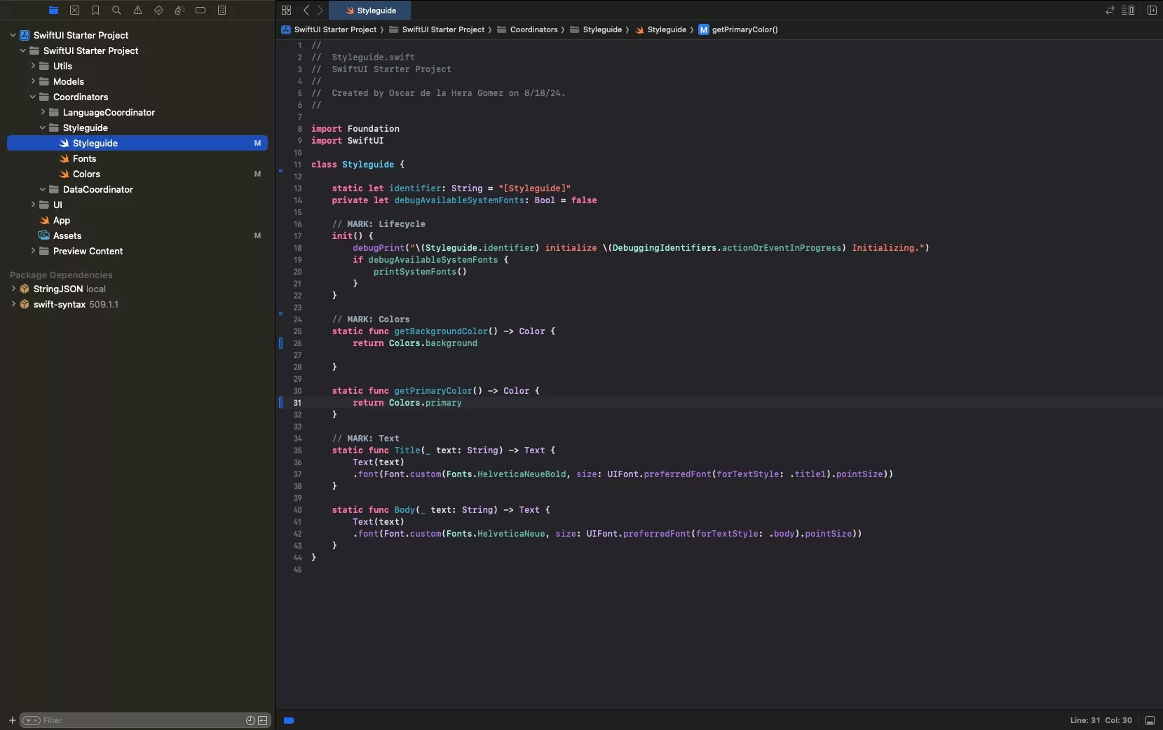
As we are using Color Sets, we no longer need to adjust based on color scheme - this is done for us automatically.
Consult the "Colors" section above and associated tutorial if you are not following how this works.
Debug Fonts
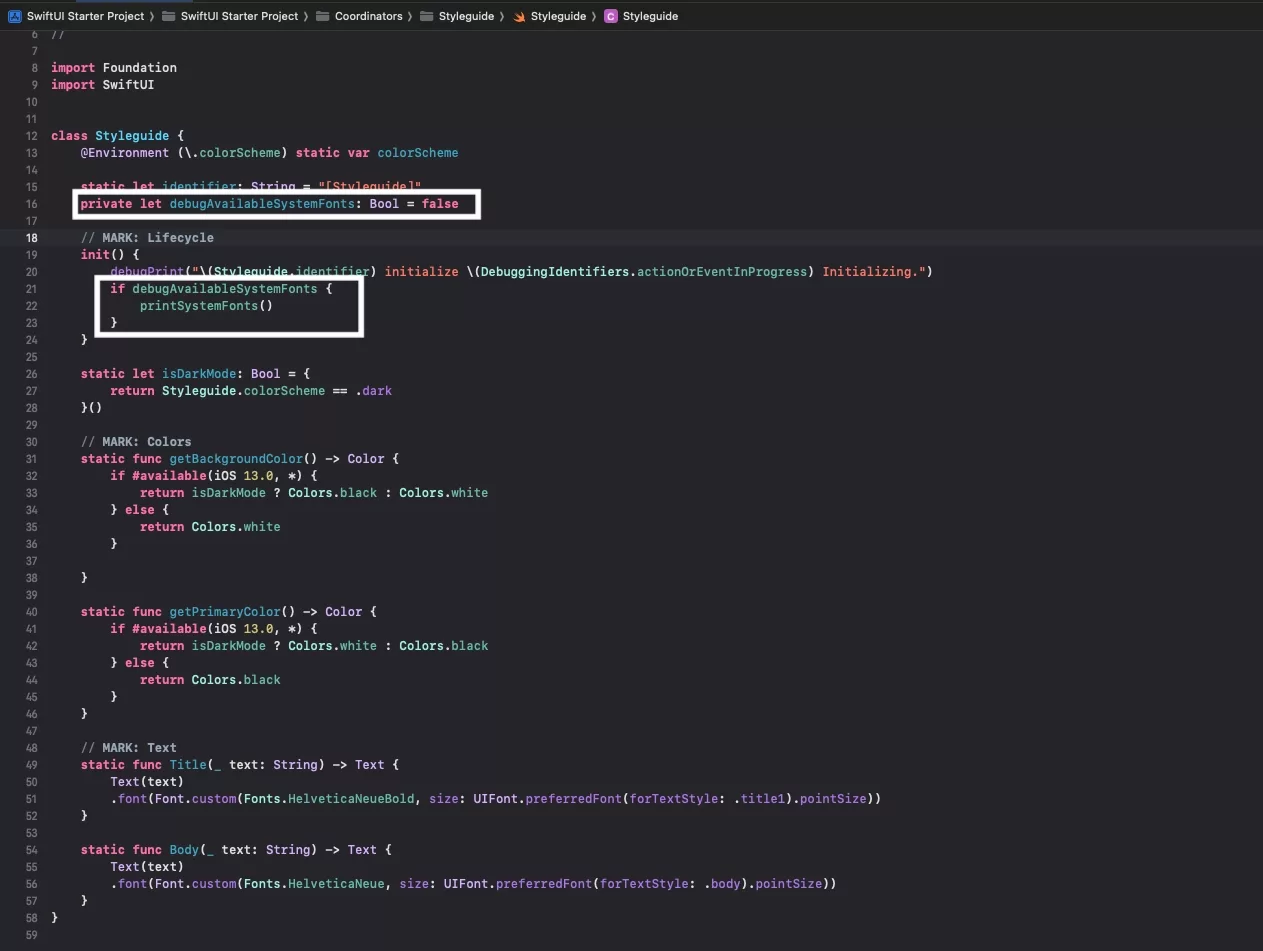
We have updated the code so that you can print available fonts by changing a boolean in the Styleguide.
All in One File
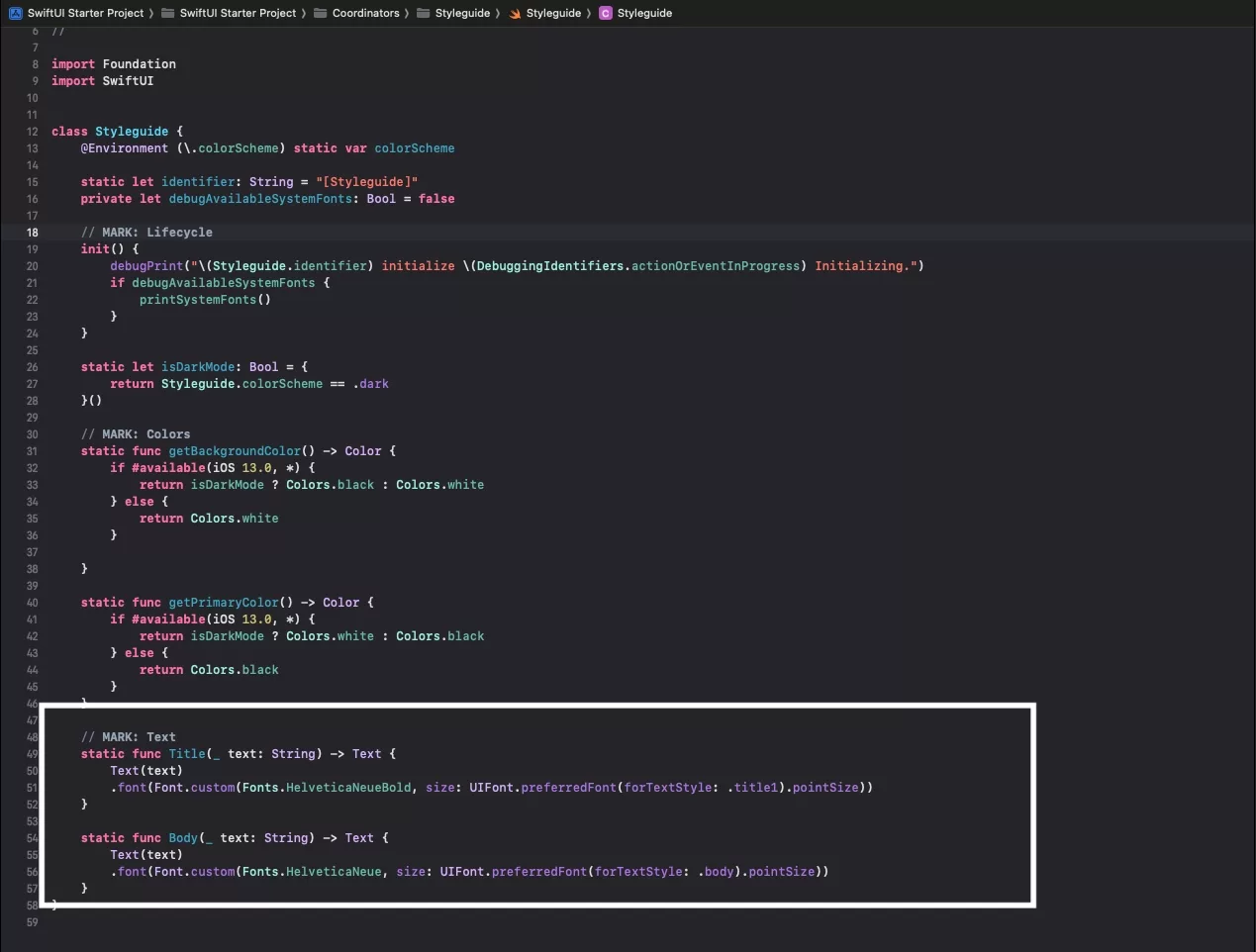
Although we recommend separate files for complex styleguide, we have chosen to place all the colors and styles in the Styleguide declaration file.
Looking to learn more about SwiftUI, Swift, Design and Technology?
Search our blog to learn more about Swift, SwiftUI, design and technology.
