Styleguide What it is & How to create one.
A styleguide is a standards manual that represents a brand or organization.

A styleguide, which is sometimes referred to as a brand book or brand styleguide, is a standards manual that represents a brand or organization and which allows a designer to create printed media, multi-media, physical products or digital applications quickly and coherently.
SubscribeWhat is a Brand Book?What are Brand Guidelines?A styleguide is something that is vital to a brand or organization in order for them to quickly output content across media channels; or upgrade/create new products coherently.
We believe that it is fundamental to any design system, whether physical or digital, and we often request it or engage in its creation early on to augment velocity during a prototyping or creation phase.
Please note that they require often updates over time, as the brand or organization evolves.
What does a Styleguide include ?
A styleguide is composed of the following key elements:
- Colors
- Typography
- Assets
- Numerical values such as margin, padding or shadow size
- UI Elements or Component Guide
- Visual Treatment Guide
- Moodboard
Colors
This refers to the color palette and can be broken into primary, secondary, tertiary and/or accents to inform a designer on how and where to use colors. If the colors are not broken up into categories, a treatment guide or moodboard is suggested to help a designer understand how to use color.
For anyone seeking to for a more extensive naming convention for all the tokens that you can use in a system, we recommend checking out Google's Material Design.
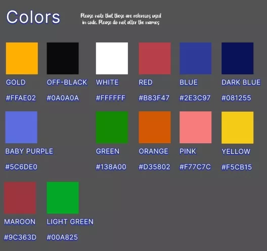
Farm Tales's Color guide
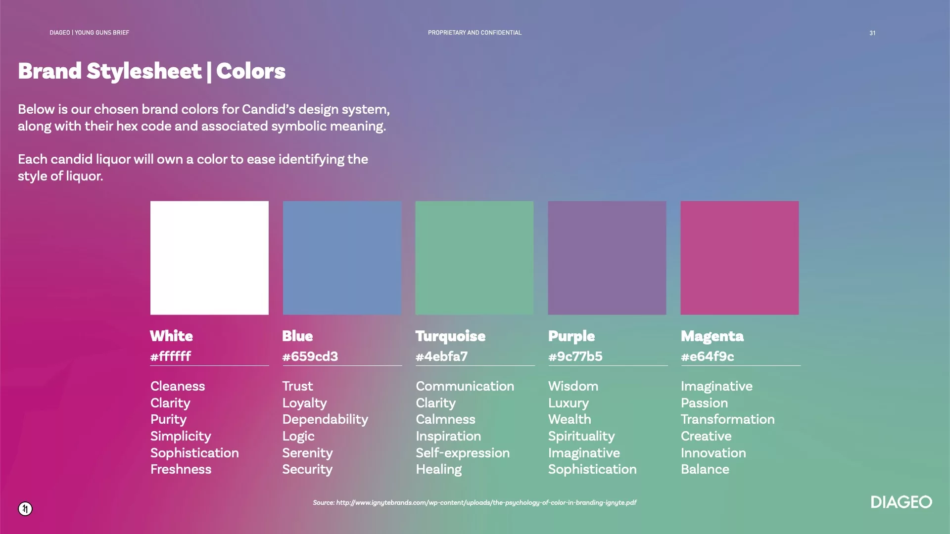
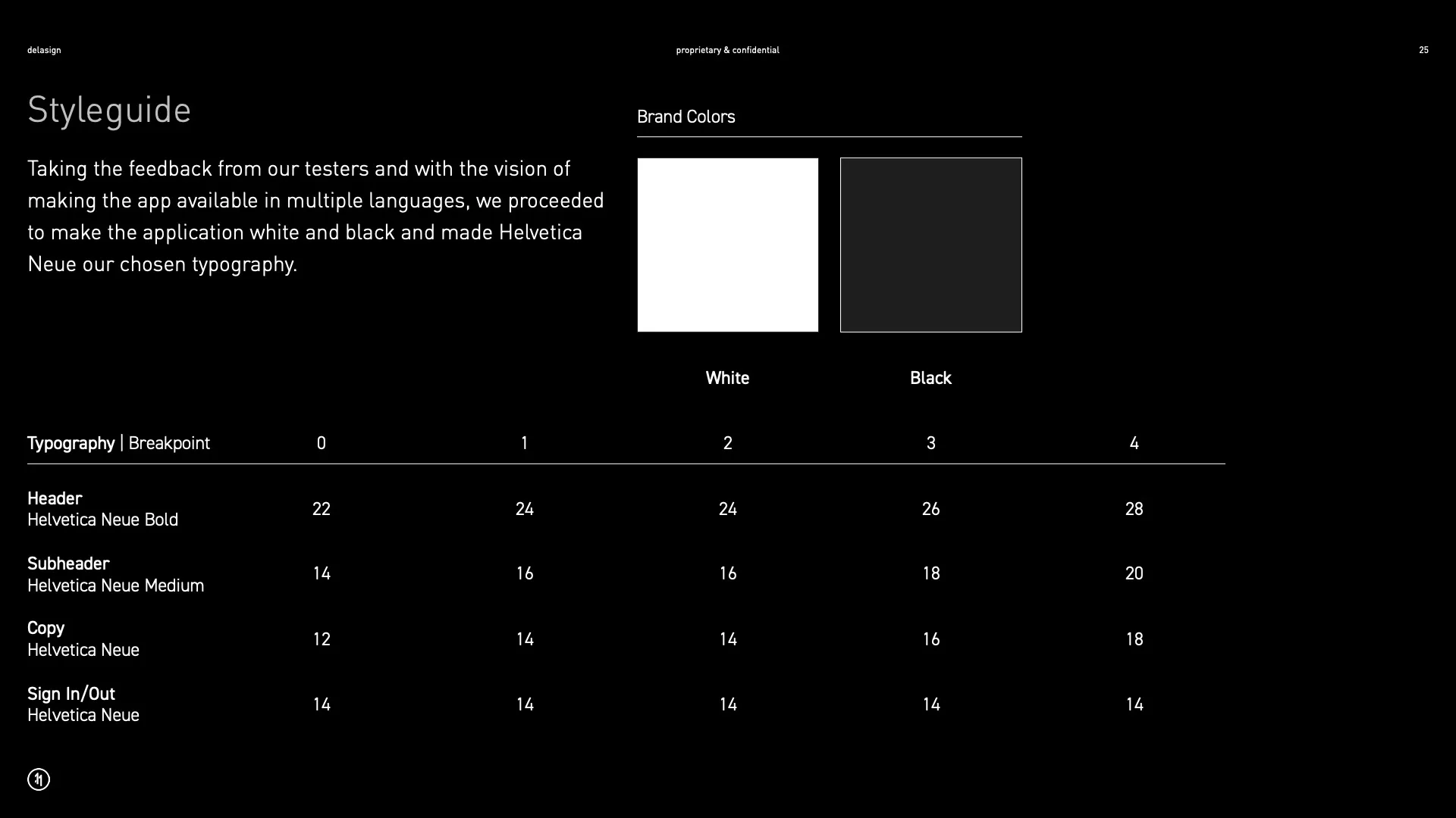
Candid's Color guide
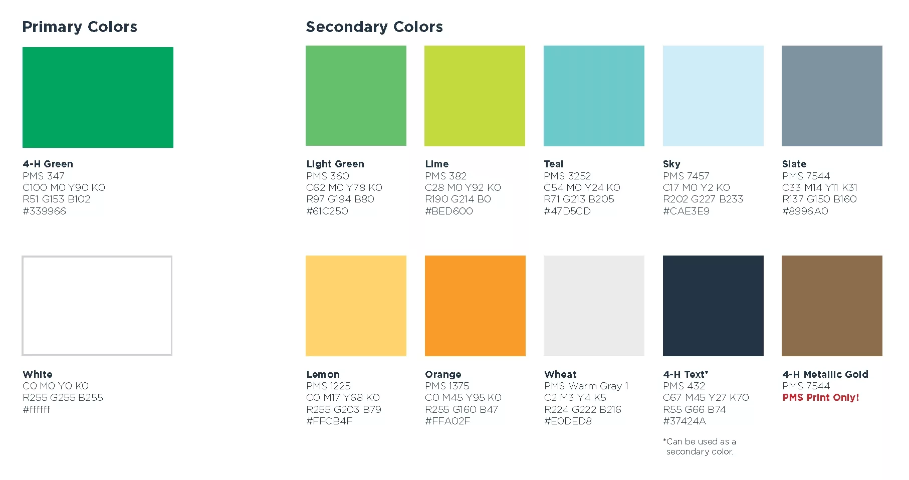
Here's an example of a colors broken down into categories.
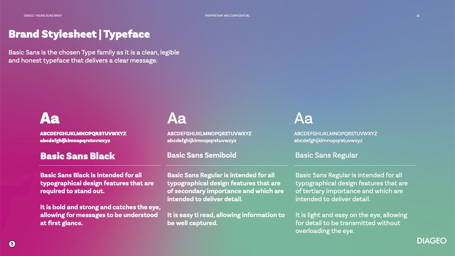
Typography
This refers to the typefaces (fonts) that are used along with their respective sizes. A typographic styleguide should ideally involve responsive font sizes that information a designer what size of font to use where and when i.e. on mobile use Helvetica Neue, 14pt.
Sans Hand's color & responsive typographic styleguide
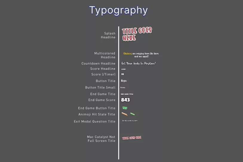
Farm Tales's typographic styleguide
Candid's typographic styleguide
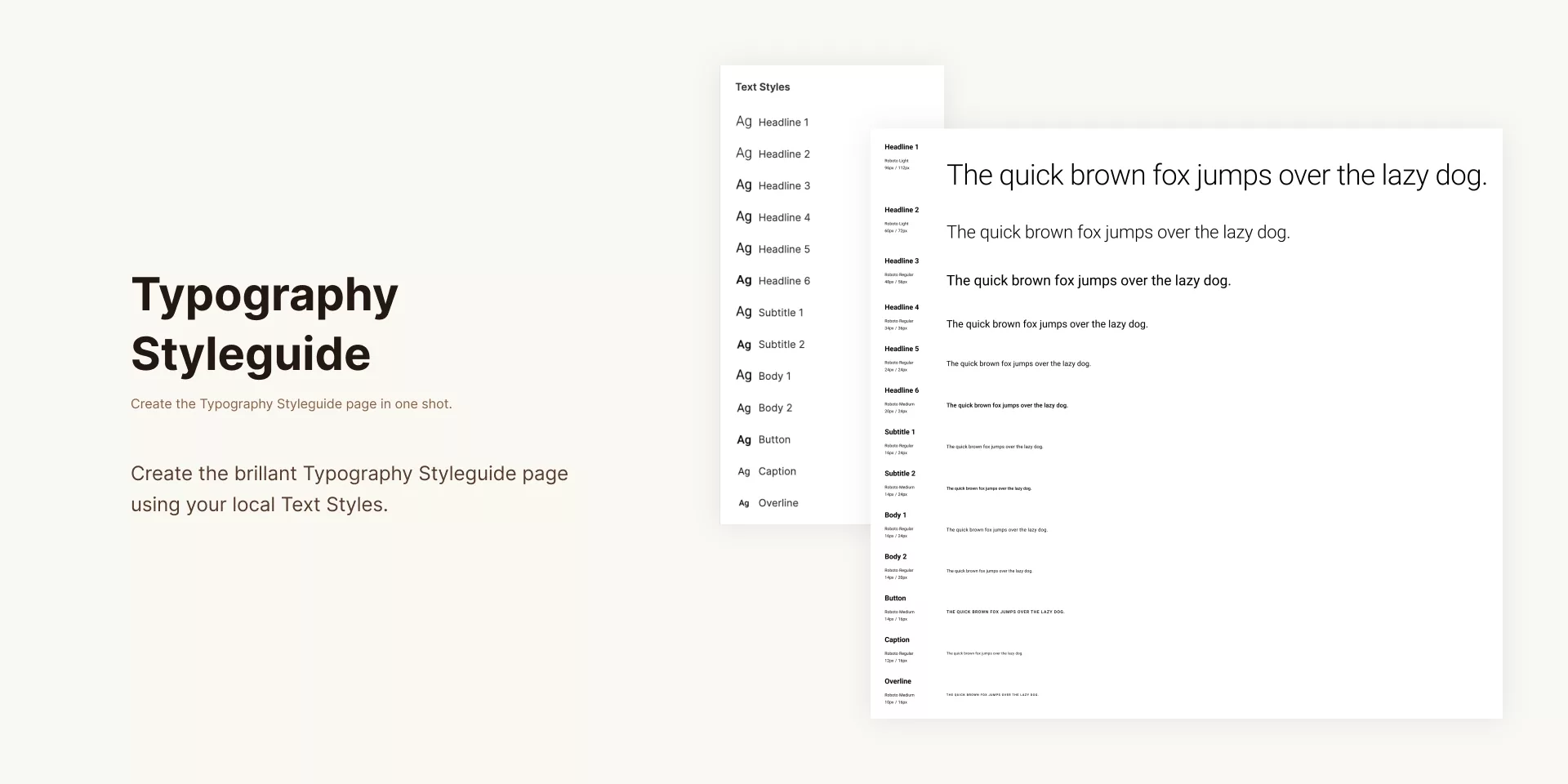
Here's what a typographic styleguide could look like for a website.
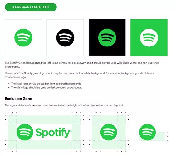
Assets
This document and associated package involves the logo and other key multimedia that are fundamental to the recreation of a brand.
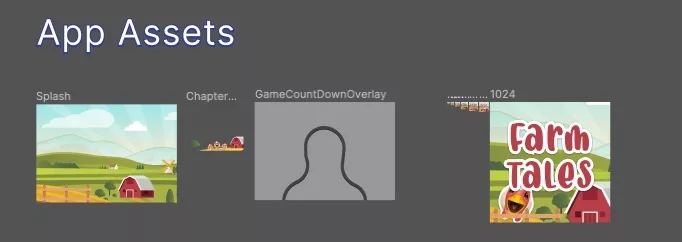
Farm Tales's Assets
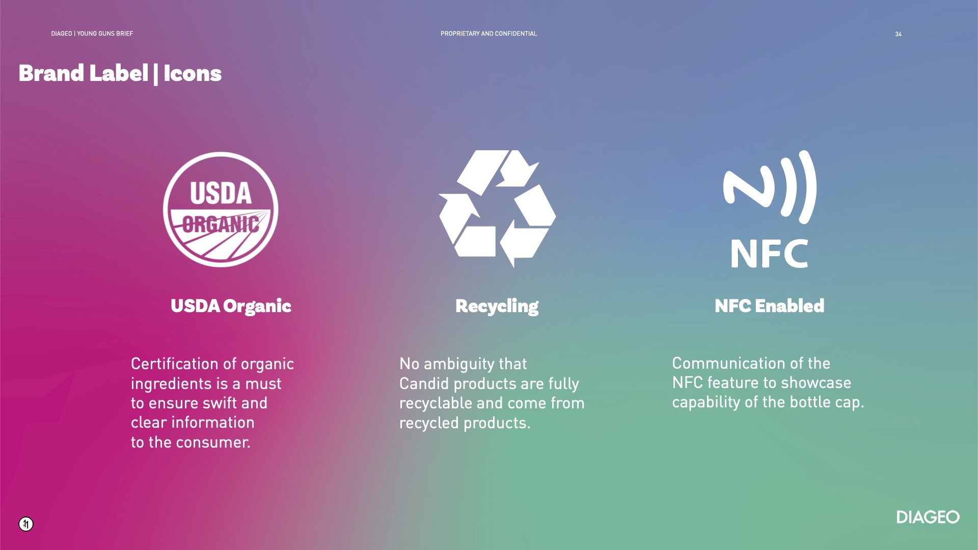
Candid's Icon Asset Guide
Optional | UI Element or Component Guide
With the vision of modularizing and building coherent systems quickly, a UI Element or Component guide allows a designer to know what components are available for use when creating new webpages or mobile experiences in a way that reduces development time.
If an application has yet to be built, this guide helps the development team identify which reusable components are needed to be built and where their flexibility lies - cutting down development time down the line.
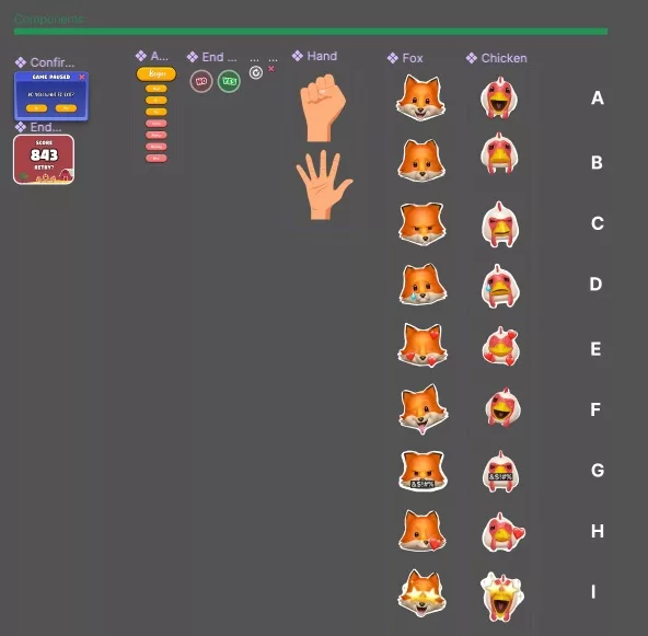
Farm Tales's Component Guide
Optional | Visual Treatment Guide
This guide refers to how media and typography should be manipulated or laid out to guarantee coherence and the expected outcome.
Visual treatment guide for Spotify's logo
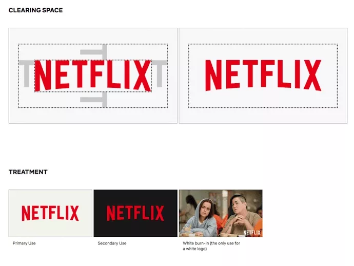
Visual treatment guide for Netflix's logo
Optional | Moodboard
This can be a PDF document or Pinterest board that shows the kind of visuals that represent the brand for a designer to take inspiration from.
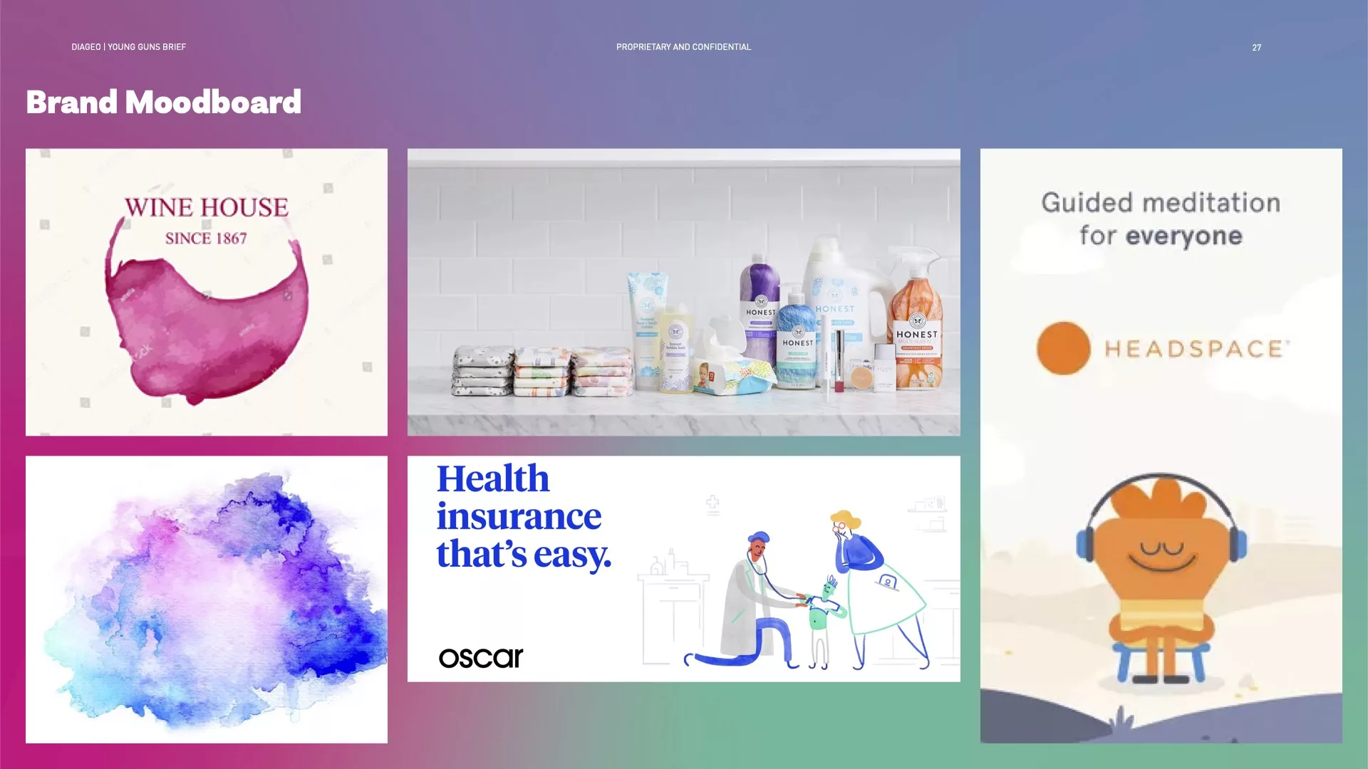
Candid's Brand Moodboard
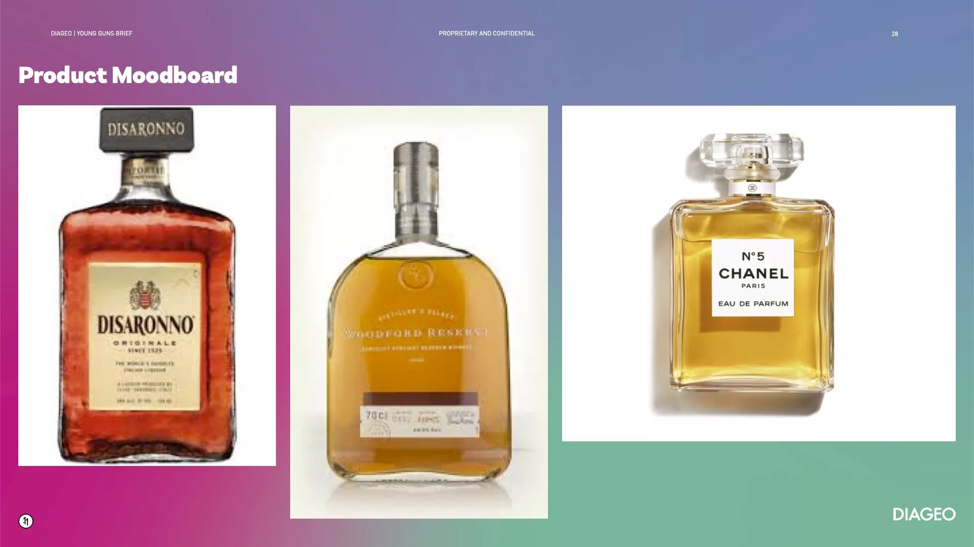
Candid's Product Moodboard
Any Questions
We are actively looking for feedback on how to improve this resource. Please send us a note to inquiries@delasign.com with any thoughts or feedback you may have.