How to create text that has a Stroke and a Gradient fill in CSS
Within a relative container, create a gradient text then separately, with an absolute position, create the same text outlined. Open Source code included.
Within a relative container, create a gradient text then separately, with an absolute position, create the same text outlined. Open Source code included.
SubscribeDownload Open Source ProjectWe recommend that you clone our Open Source React-Redux Starter Project, checking out the main branch and apply the code found below to the App.tsx file. The changes can be found on the tutorial/typography/gradient-outline branch.
git clone git@github.com:delasign/react-redux-starter-project.gitAs shown below, if you attempt to create a gradient text with an outline within the same html element, it will not function as expected.
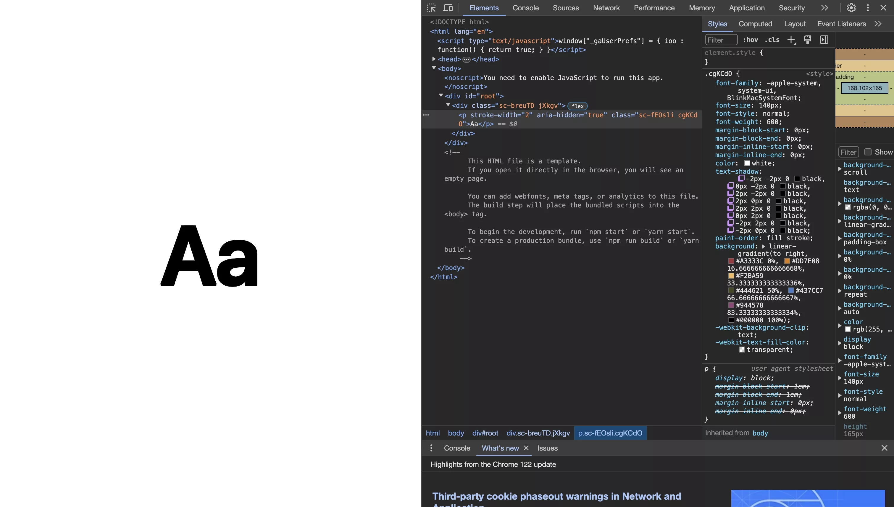
This error can be reproduced by returning the renderCombinedGradientAndText function within the App.tsx code found below.
If you combine the code from the gradient text tutorial and the outlined text tutorial within a relative container and add an absolute position to the outlined html text element, it will appear that you have achieved the desired result.
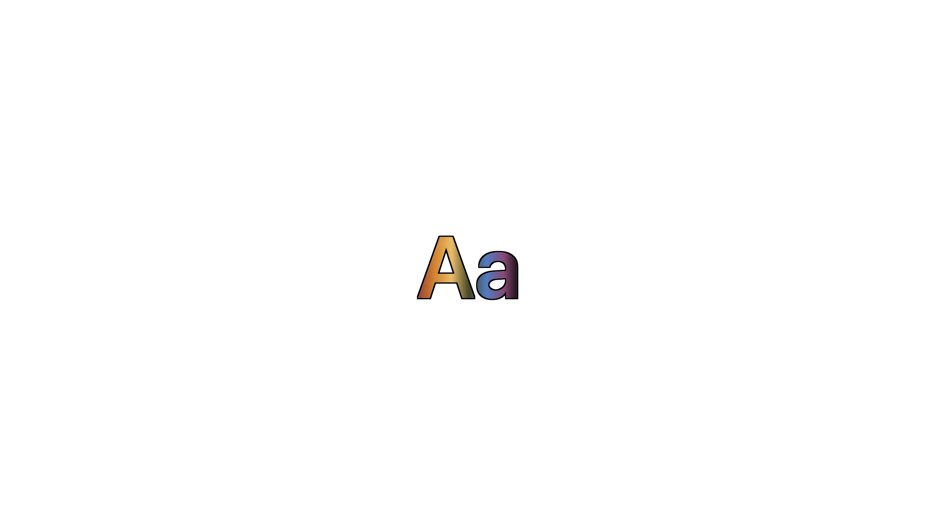
The solution without applying a background color appears to work.
However, if you attempt to change the background color of the html element that holds the html text elements, the gradient will be removed.

The solution after applying a background color.
If you try to layer the two elements using absolute position and add a separate element, they will overlap.
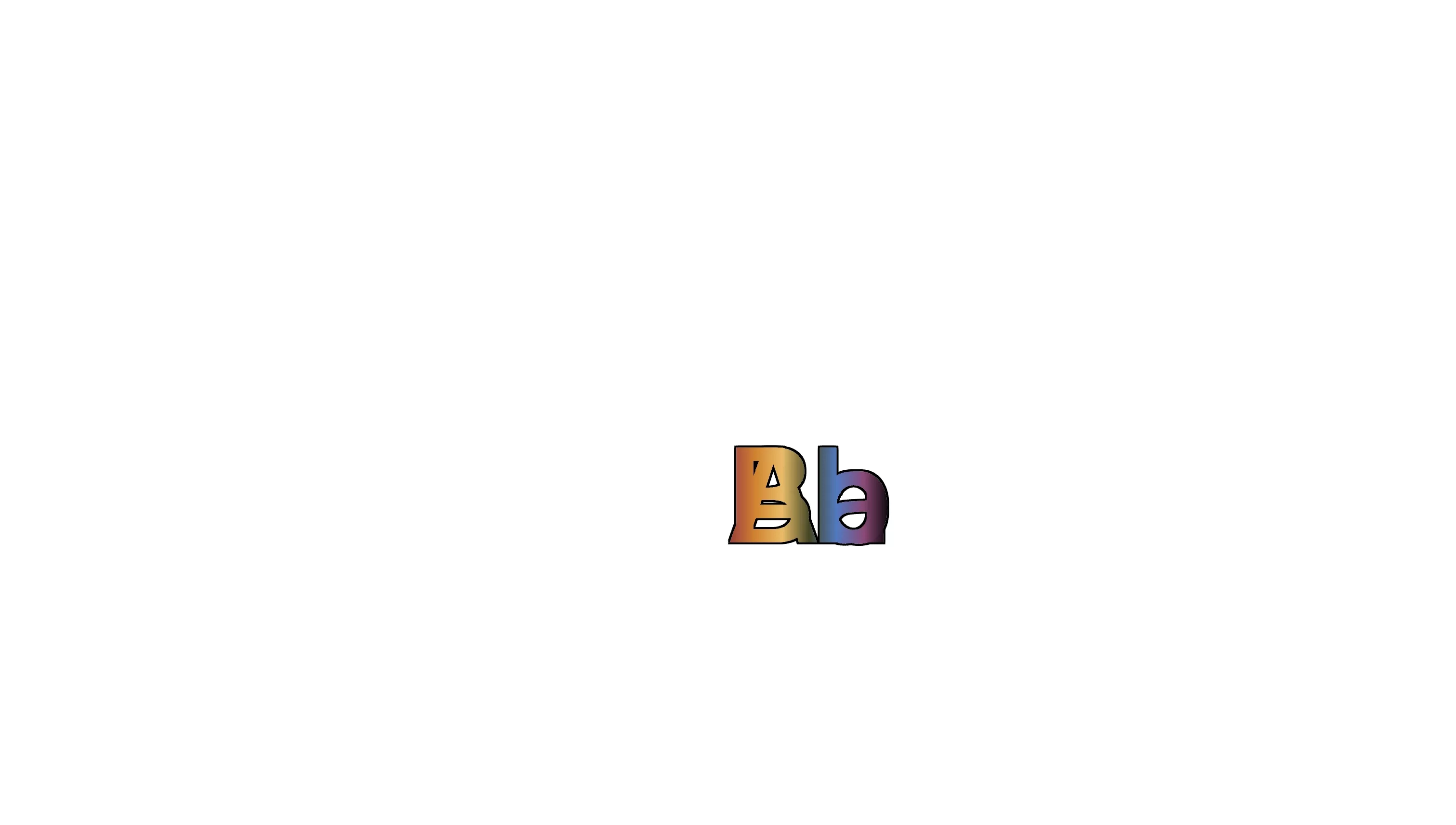
Therefore, the final solution is to create the element, with two additional, identical elements on top of it. This will allow you to add additional elements and create the desired visual outcome.
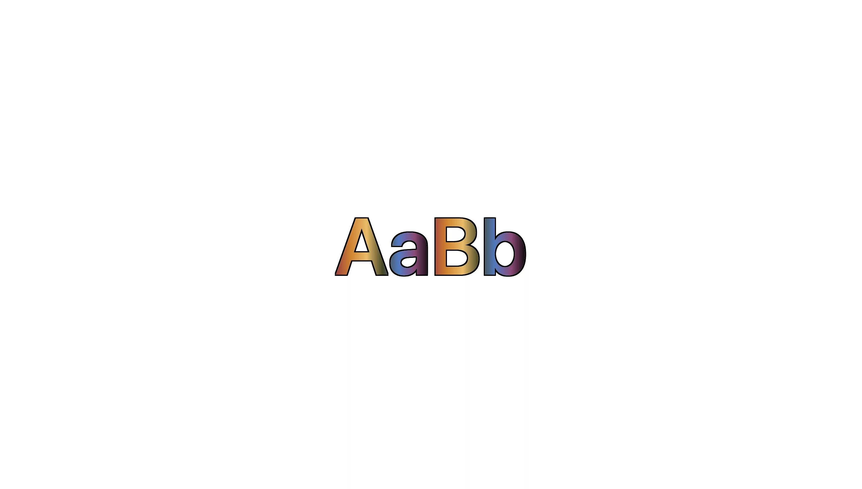
This solution can be reproduced by returning the renderSuperpositionedText function within the App.tsx code found below.
The code for the final solution is found below and creates:
- A html text element that does not use a position css attribute, in this case we have chosen to use a replica of the gradient, to match the size and content of the text in order to provide the exact dimensions for its parent relative container.
- An outlined html text element with the position set to absolute and the z-index set to 1.
- A gradient html text element with the position set to absolute and the z-index set to 2, so it is above the stroke.
- The code sets the top and left css properties of the html text elements that use an absolute position 0 so that they perfectly align above the original html text element (i.e. the html element described in the first bullet point).
Finally, for accessibility purposes, the code sets aria-hidden to true for both elements that use an absolute position to make the screenreader read the text correctly.
Looking to learn more about ReactJS and CSS ?
Search our blog to find educational content on learning how to use ReactJS and CSS.