How to create a multi-section UICollectionViewCompositionalLayout
A step by step guide on creating a UICollectionView that uses a compositional layout with multiple sections and multiple UICollectionViewCells in Swift.


A step by step guide on creating a UICollectionView that uses a compositional layout with multiple sections and multiple UICollectionViewCells in Swift.
SubscribeThe following tutorial uses our Open Source Swift Starter Project to walk you through how to create a UICollectionView which has multiples sections and that uses fixed and dynamically sized UICollectionViewCells.
If you are seeking a tutorial that specifically covers how to make cells that dynamically adapt their size to fit their content, please consult the article below.
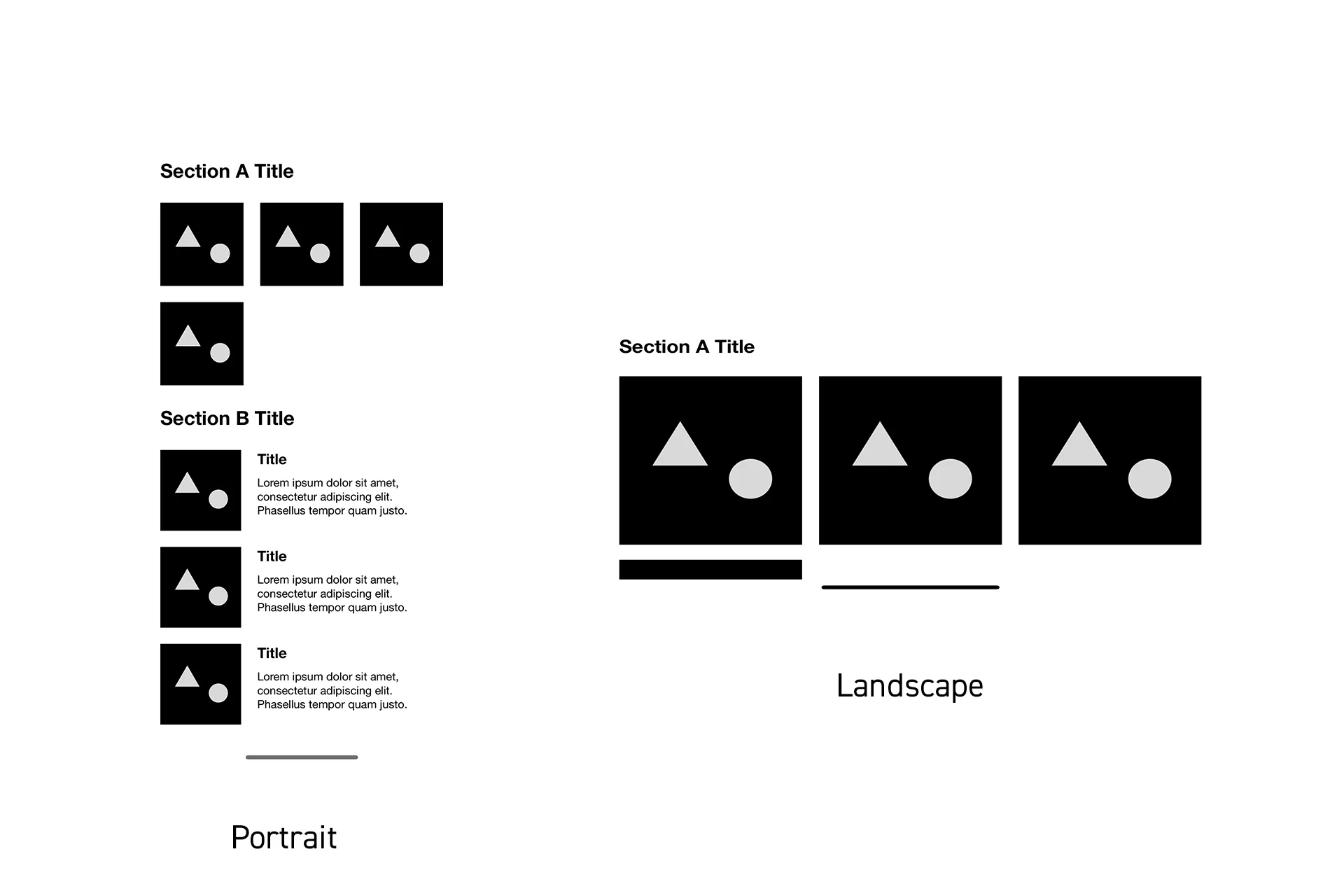
Specifically, this tutorial will walk you through how to create an app that provides the functionality illustrated above. A process that involves creating a two-section UICollectionView which uses a UICompositionalLayout that implements three UICollectionViewCells.
Please note that this tutorial creates the same layout as that which we created as part of our "How to create a UICollectionView with multiple sections in Swift" tutorial which is available below
Please note that the UICollectionView and all UICollectionViewCells that are created in this tutorial follow our structured UIView methodology, which splits functionality into logic extensions for enhanced performance.
We recommend that you clone our Open Source Swift Starter Project, checking out the main branch and carrying out the steps below. The changes can be found on the tutorial/uicollectionview/multi-section-compositional-layout branch.
git clone git@github.com:delasign/swift-starter-project.gitPlease note that we have removed all the label functionality from the CustomUIView and associated extensions. The details regarding the changes due to the removal of the label and initial sample string is not included in this tutorial.
Step One: Create the content
The following step is intended to create the sample strings that will be consumed by the app.
This step builds on our Localization tutorial which is available below and follows our methodology that allows apps to be created for multiple languages.
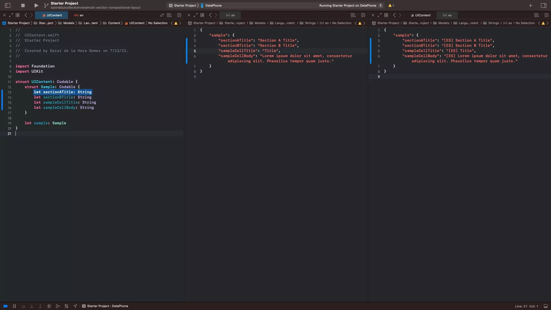
A | Create the UIContent
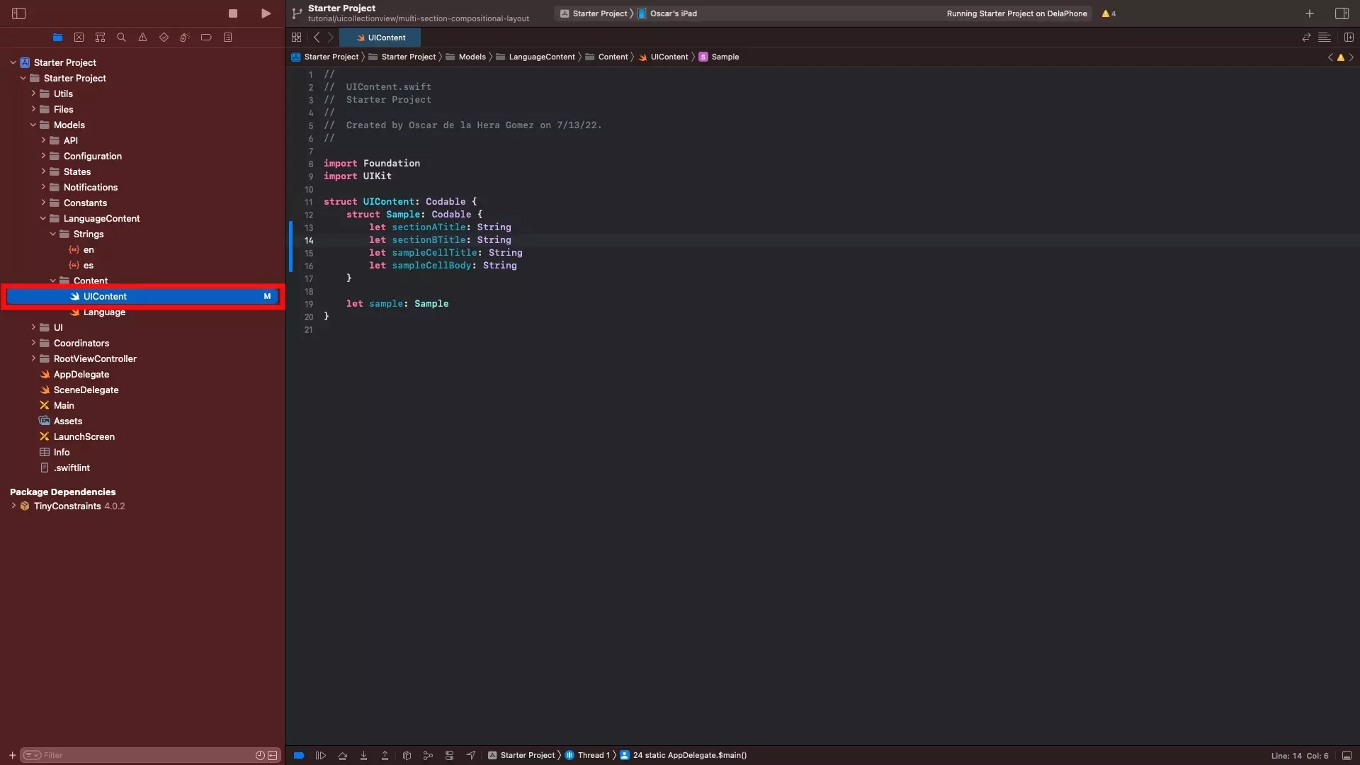
Add your content to the UIContent file.
In our case we have added two section titles, a sample cell title and a sample cell body.
B | Add Strings
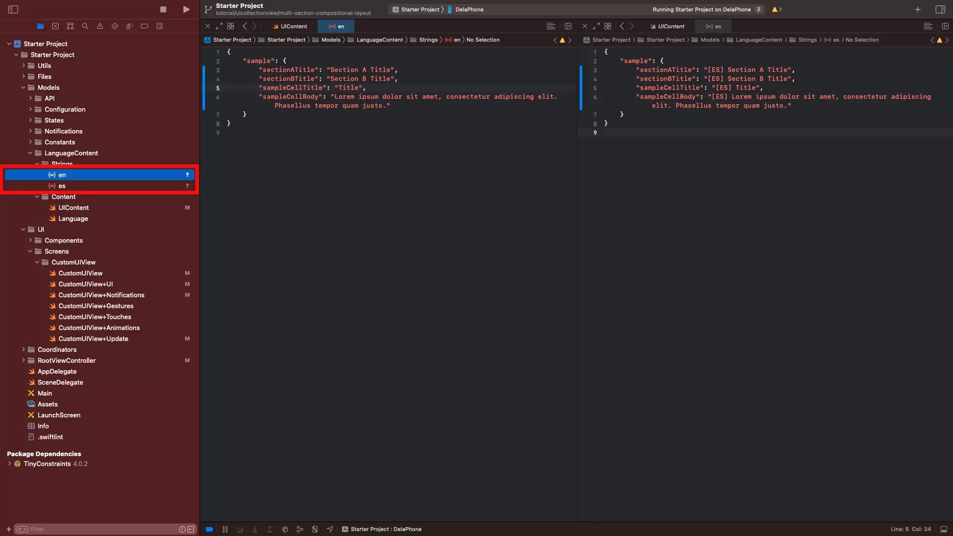
Add the relevant strings to en.json and es.json; or the necessary language files for the app to operate.
Step Two: Add the Attributed Styles
As part of this step, we will adapt the fonts that are available to the app and create a series of attributed styles that are required to meet the visual requirements of the app's design.
For more information on how to create these or why we use them, please consult the articles below.
A | Update the Fonts
Under Models/Constants, update the Fonts.swift file to include Helvetica Neue Bold.
This step is required to be able to create the required attributed styles.
B | Create the Header Style
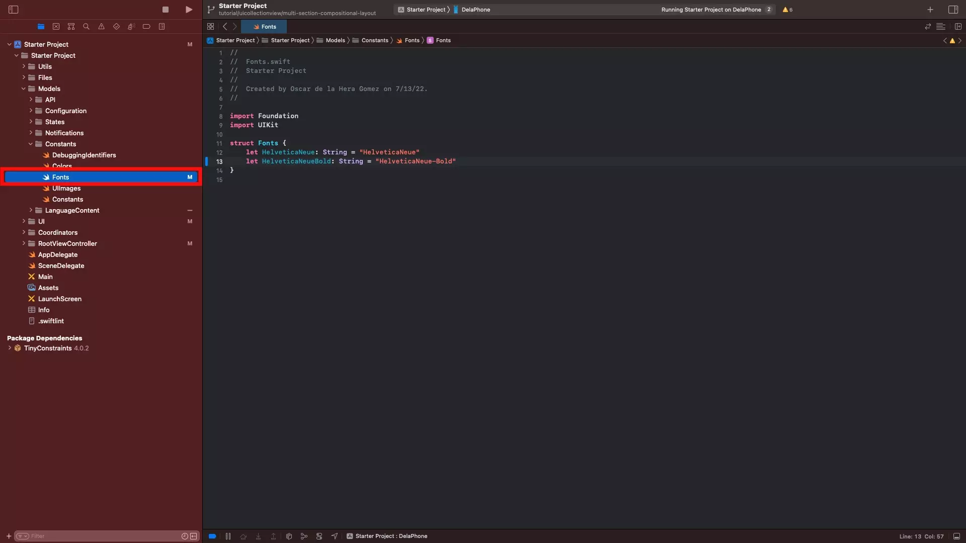
Under the Coordinators folder, within the Styleguide folder, create a new file called Styleguide+Header.swift and paste in the code found below.
C | Create the Cell Title Style
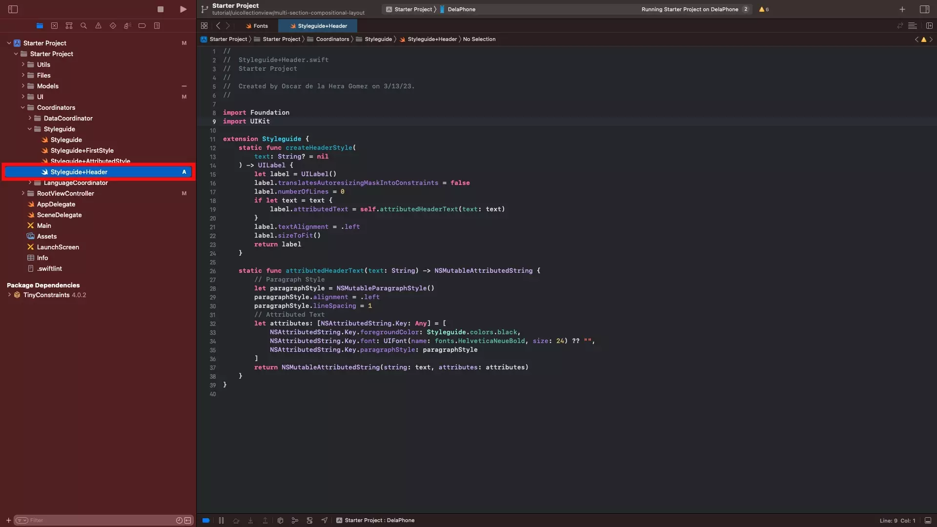
Under the Coordinators folder, within the Styleguide folder, create a new file called Styleguide+CellTitle.swift and paste in the code found below.
D | Create the Cell Body Style
Under the Coordinators folder, within the Styleguide folder, create a new file called Styleguide+CellBody.swift and paste in the code found below.
Step Three: Create the Title Cell
The following step creates a UICollectionViewCell for the section titles.
A | Create the TitleCell declaration file
Within the UI/Components folder, create a folder called TitleCell.
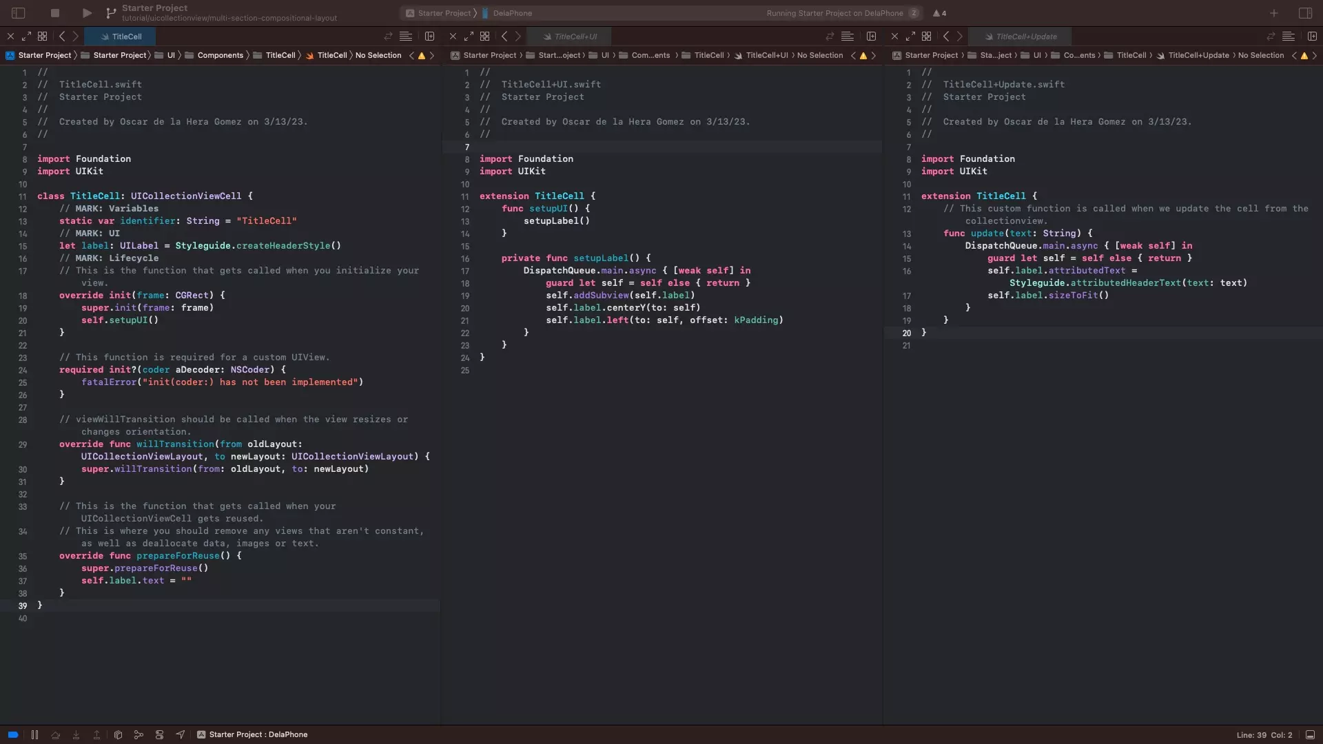
Within the TitleCell folder, create a file called TitleCell.swift and paste in the code found below.
Please note that the setupUI function is created in Part B.
B | Create the TitleCell UI extension
Within the TitleCell folder, create a file called TitleCell+UI.swift and paste in the code found below.
C | Create the TitleCell Update extension
Within the TitleCell folder, create a file called TitleCell+Update.swift and paste in the code found below.
Step Four: Create the Section A Cell
The following step creates a UICollectionViewCell for section A.
A | Create the SectionACell declaration file
Within the UI/Components folder, create another folder called SectionACell.
Within the SectionACell folder, create a file called SectionACell.swift and paste in the code found below.
Please note that the setupUI function is created in Part B.
B | Create the SectionACell UI extension
Within the SectionACell folder, create a file called SectionACell+UI.swift and paste in the code found below.
C | Create the SectionACell Update extension
Within the SectionACell folder, create a file called SectionACell+Update.swift and paste in the code found below.
Step Five: Create the Section B Cell
The following step creates a UICollectionViewCell for section B.
A | Create the SectionBCell declaration file
Within the UI/Components folder, create a folder called SectionBCell.
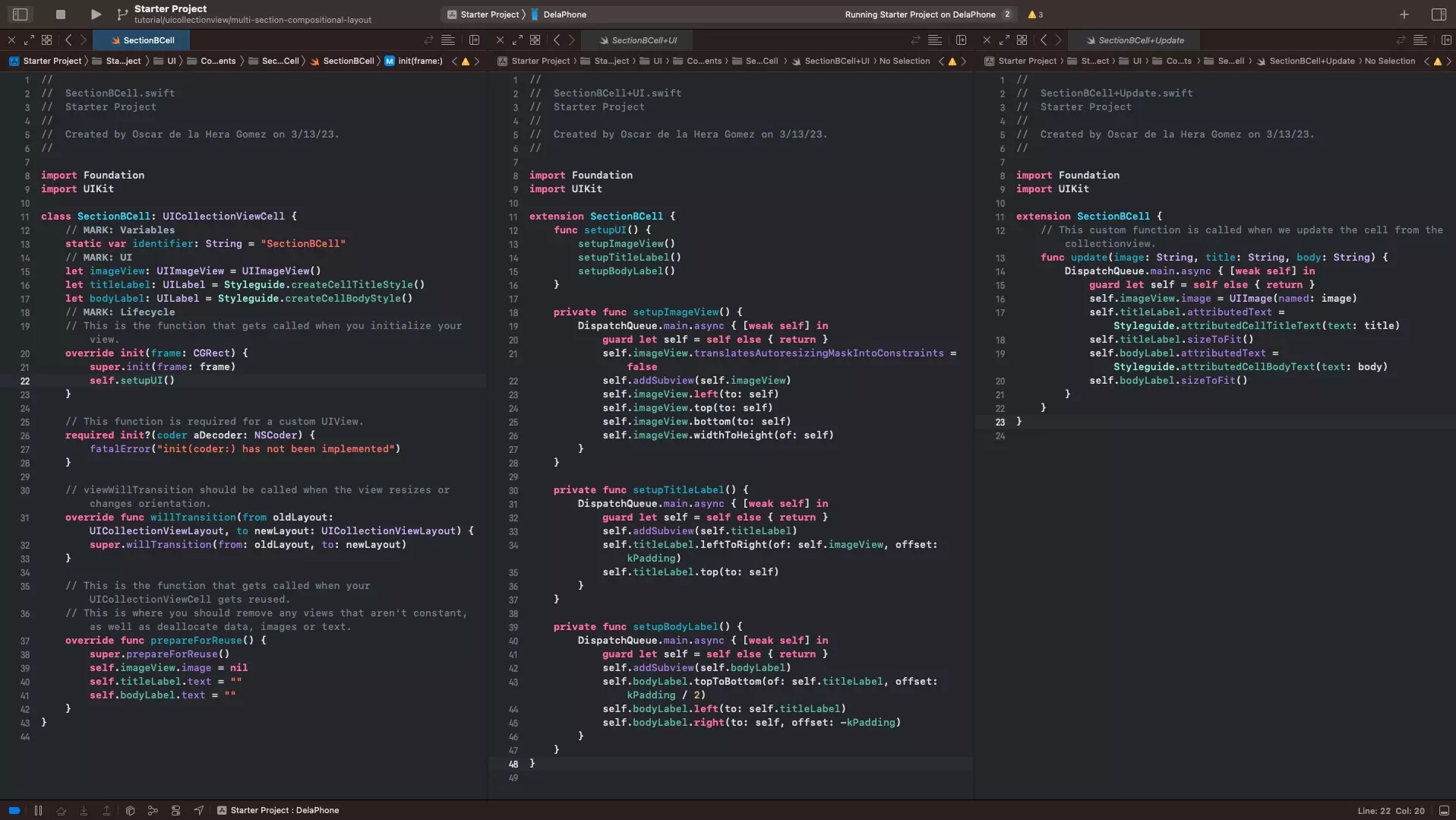
Within the SectionBCell folder, create a file called SectionBCell.swift and paste in the code found below.
Please note that the setupUI function is created in Part B.
B | Create the SectionBCell UI extension
Within the SectionBCell folder, create a file called SectionBCell+UI.swift and paste in the code found below.
C | Create the SectionBCell Update extension
Within the SectionBCell folder, create a file called SectionBCell+Update.swift and paste in the code found below.
Step Six: Create the UICollectionView
The following step walks you through the creation of the UICollectionView.
A | Declare the UICollectionView, Sections and Datasource
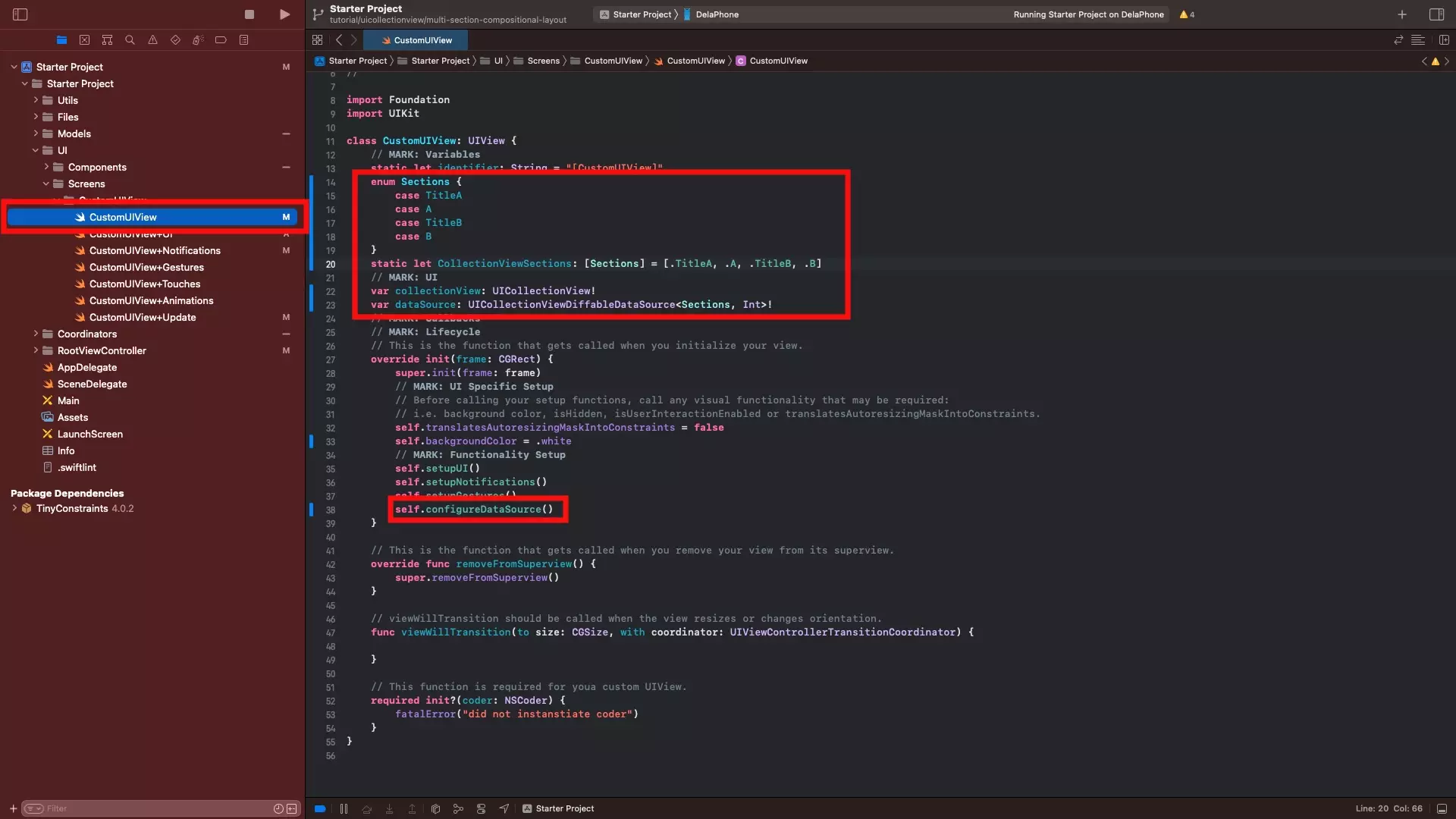
In CustomUIView.swift, declare the following variables:
- Sections - This is an enum that allows you to name sections for the UICollectionView. As you cannot get the IndexPath Row when formatting cell sizes, we recommend that you make SectionTitles their own section (i.e. TitleA or TitleB).
- collectionViewSections - This is a static enum that holds the sections of the UICollectionView, in the order that you wish to use them (i.e. TitleA, A, TitleB, B).
- collectionView - This is the variable for the UICollectionView.
- dataSource - This is the variable for the datasource of the UICollection View.
Finally, make sure that you call configureDataSource, in the init(frame: CGRect) function. The configureDataSource function will be created in part C of this step.
Our sample code for the part of this step is available below.
B | Setup the UI
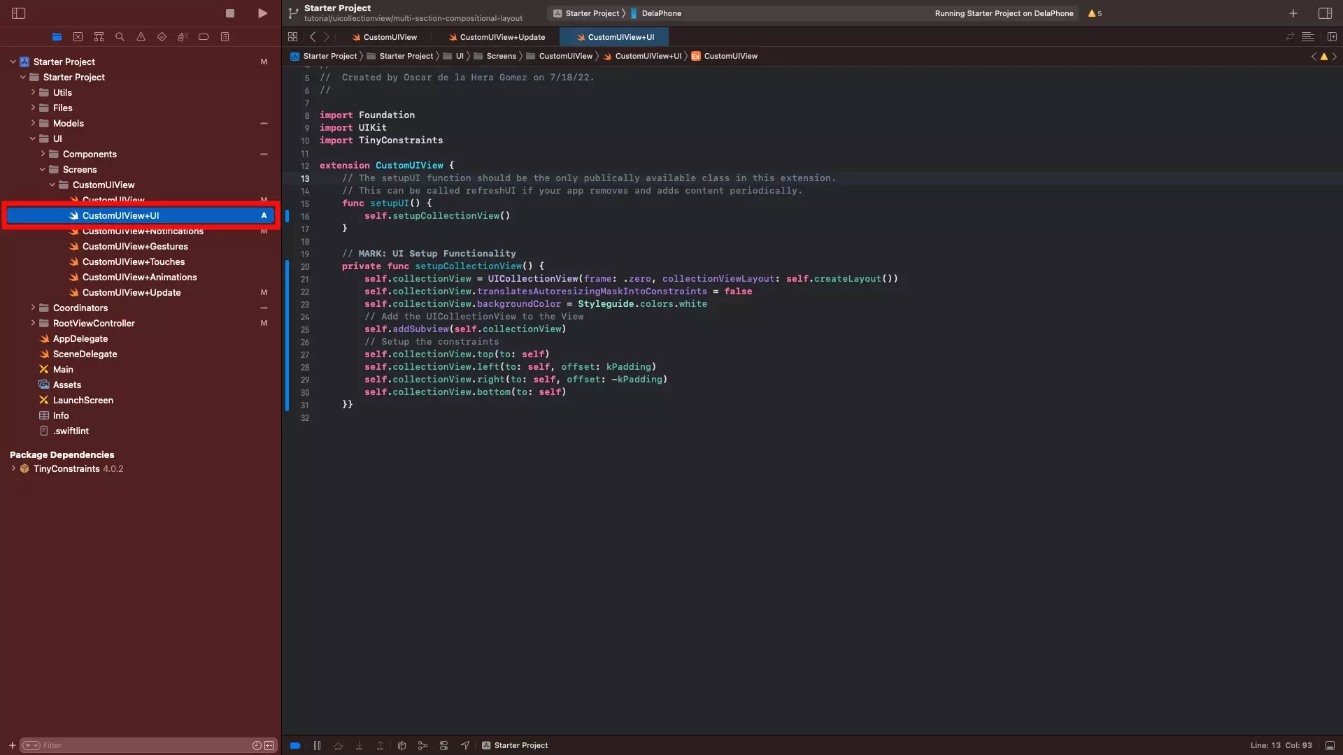
In CustomUIView+UI.swift setup the UICollectionView.
Sample code on how to achieve this is available below.
Please note that the setupCollectionView cannot be wrapped in a DispatchQueue.main.async as it will cause the configureDataSource to crash due to the collectionView being unwrapped as nil.
Additionally, as demonstrated by the sample code provided, you do not need to register cells in a UICollectionViewCompositionalLayout.
C | Create the UICollectionView Extension
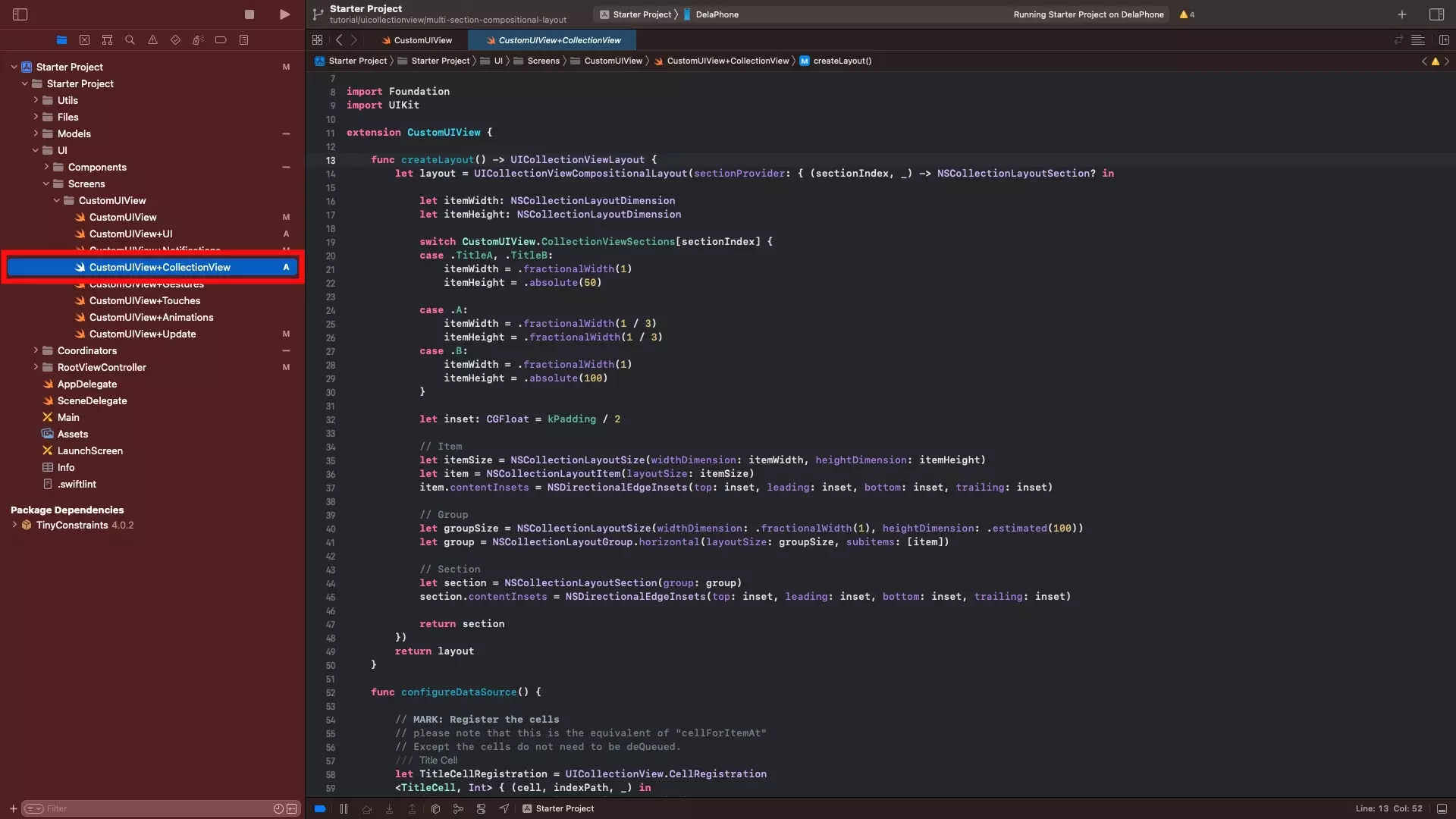
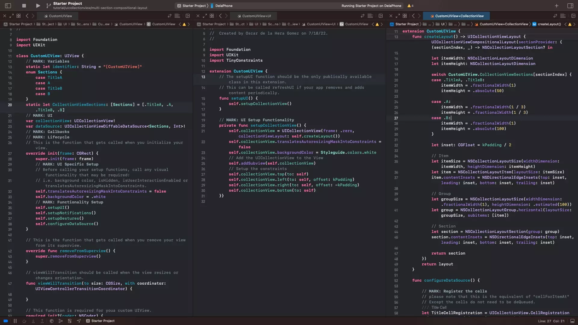
In the CustomUIView folder, create a new file CustomUIView+CollectionView.swift and paste in the code below.
- The createLayout function is consumed by the UICollectionView when we set it up the UI extension and is responsible for dictating the dimensions and insets for each section and cell within the collectionView. In the event that you use an estimated NSCollectionLayoutDimension, the cell with size to fit the content - whilst absolute will hold to that number and fractional values will maintain proportion.
- The configureDataSource function is responsible for creating the data source for the UICollectionView, determining how the cells update in the UICollectionView and creating a link between the data source and the UICollectionView.
Step Seven: Invalidate the layout
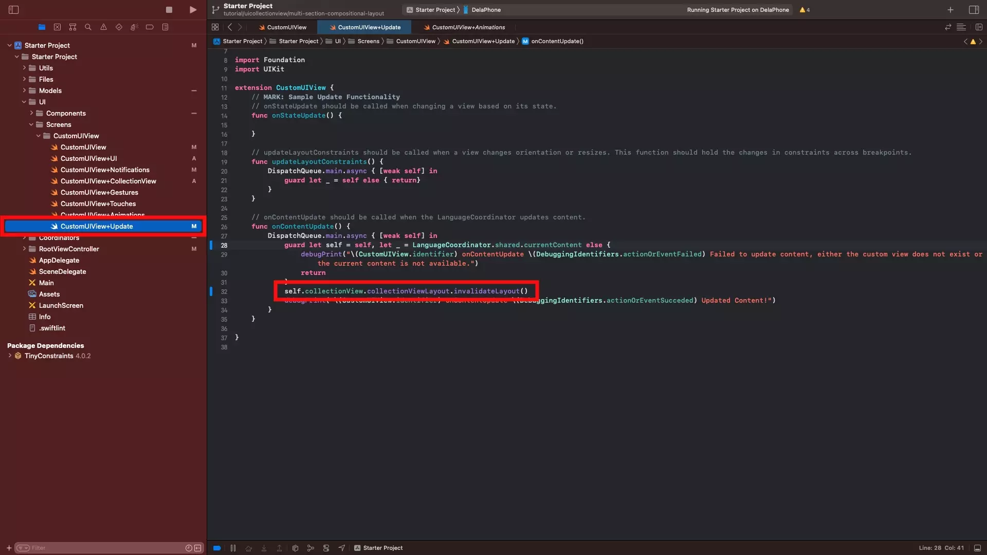
In order for the algorithm to work, the UICollectionView must reload its data when the content updates.
To do this invalidate the layout in the onContentUpdate function in CustomUIView+Update.swift through code similar to the one provided below.
self.collectionView.collectionViewLayout.invalidateLayout()Step Eight: Verify
Run the app and you will see that the layout matches the image above, and updates when you change orientation.